
Create Responsive Emails with FireDrum’s New Drag and Drop Builder
Remember when mobile-responsive websites made its debut? It was a new concept to the business world. Now days, companies who don’t have responsive sites are doomed to fail (and we concur). After all, more than 50% of websites AND emails are accessed through a mobile device. Your content needs to be clear, legible, clean and easy to navigate for your subscribers. If your design displays otherwise, you can count on losing sales.
With our new drag and drop builder, building your emails will be a breeze (giving you time to focus on branding, content creation and optimization). Each building block has default padding space and is pre-coded to become responsive once you switch to mobile – yes, it’s that easy. These emails will look beautiful in your subscriber’s mobile and desktop inboxes.
If you’re having a creative block and are not sure where to start, explore our free template library! These free newsletter templates are completely customizable and are bullet-proof tested for every kind of device.
Newsletter Design: What’s the Winning Layout?
Think about a recent promotional email you’ve gotten lately. Did anything in particular stand out? Were any emails hard to read or hard to navigate? When it comes to template design, less is more. Your goal as an email marketer is to lead your customers to purchase something from you. You want to impress and entice your customers with your written content and graphics. Give your customers one choice. Don’t confuse them with multiple options. Make sure each email campaign focuses on a single goal with a clear message.
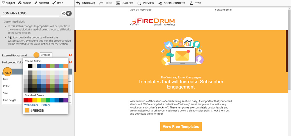
 In this particular campaign we’ve concentrated on free templates. Our graphic is attention grabbing but doesn’t take up the entire screen. Our title clearly states what is being offered and offers some insight to why people should continue reading. Our description is enticing and persuasive, but very friendly. We have one call-to-action (or button), that will increase subscriber engagement (see what we did there?)
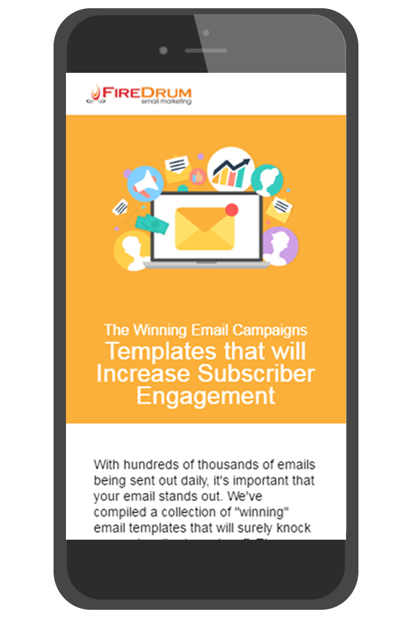
The best part about the email layout from above is the effortless, beautiful mobile rendering. Because of the email’s simplicity, the mobile version isn’t crowded or ridiculously long. Mobile users will have the same experience as desktop users would have.
Mobile Responsiveness
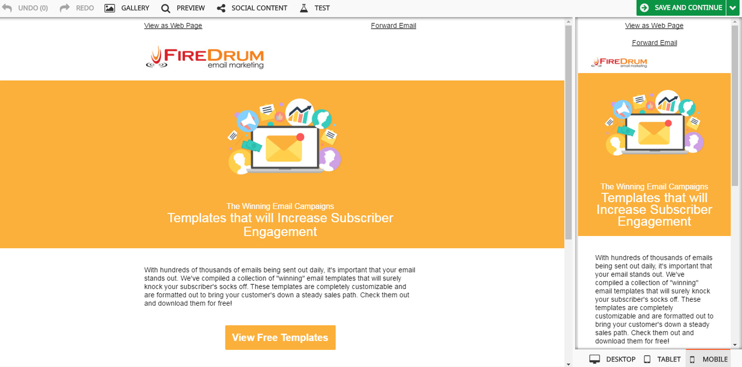
While building your email campaigns on FireDrum, a live mobile and tablet preview will be generated on the right of your screen. To preserve readability and user experience, some text elements and graphics may look different (stacked blocks instead of the side-by-side view), when you switch to other devices.
Inbox Preview Assistant Test
You may already have an idea in mind of what you want your email to look like. We encourage creativity but want to warn you about some current, not-so-mobile-friendly trends. Like responsive websites, you must make sure your email flows nicely and includes all information in an organized layout when you switch to smaller screen. Keep an eye out for changes while you create your next campaign! Take advantage of inbox preview assistant feature to test how your email looks in 54 different web browsers and mobile devices. Get started.
Want Free Email Newsletter Templates? Contact us today and ask about our hundreds of free email newsletter templates updated daily. These templates are completely customizable to fit your brand and your message.